Hello! Today I am sharing a project for AECP inspired by the class called “Color Your Day” taught by Therese Calvird.
I was really inspired by day 5, where Therese talked about all the ways your coloring can look different…depending upon what medium you used, what ink you used, or what embossing you used. So I thought I’d give it a try!
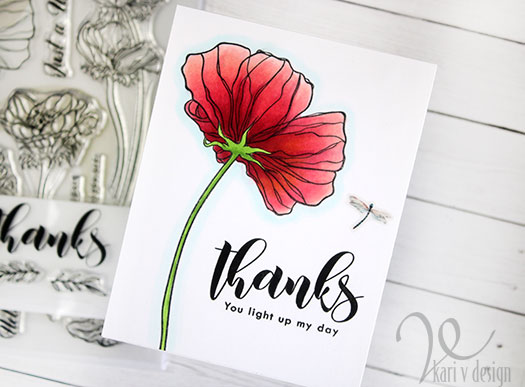
I inked up one of my favorite flowers from the Wonderland Stamp set in a variety of ink & embossing powders. One in clear embossing powder, one in white, and one in black embossing…then I watercolored them with Zigs. Then I also inked one with Amalgam ink to color with Copics. Can you guess which one is which?
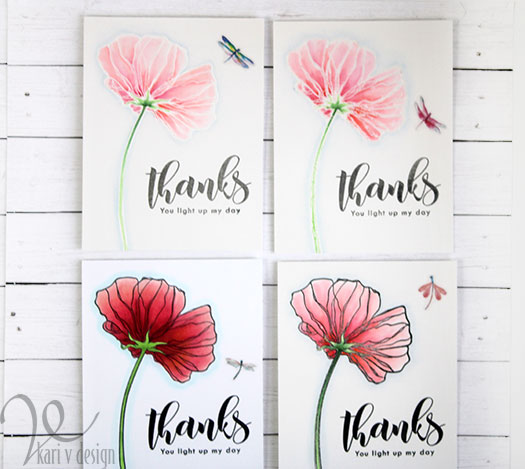
This was an interesting color study, as different mediums and different inks really make a difference in the way the cards look.
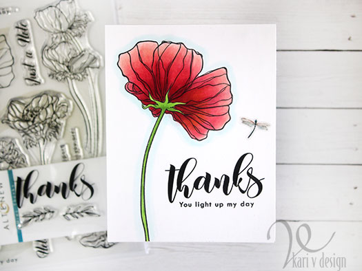
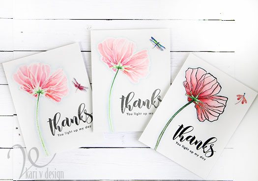
I do think they have a different feeling, and I chose similar colors and coloring techniques to make them as similar as I could.
I used the same sentiments on all of them also, using some greys and black inks. (I thought the lighter cards needed a softer color sentiment, so I used gray ink).
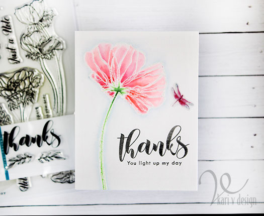
I used a light blue color around each of the flowers to make it stand out more. I love the differences in these, and it was quite a fun study of color/mediums for cards.
I hope you enjoyed these projects today! Give it a try to see how your cards have a different feel with different mediums & embossing powders. It’s a fun exercise!
Thanks for stopping by today!








LOVE LOVE LOVE!! Amazing work!
Thank you for entering your work to the AECP assignment gallery.