Tag Archives | AECP
striped-mom-crd-close-up

For Mom

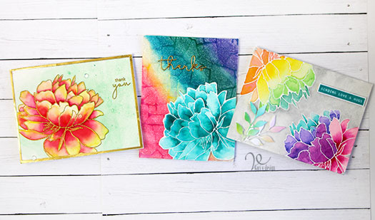
Hello! Today I’m sharing a project I’ve been working on for a while as a part of my AECP certification. I took a course from Nina Marie Trapini called “Polychromatic.” And, since mother’s day is coming right up, I thought I’d combine these ideas!

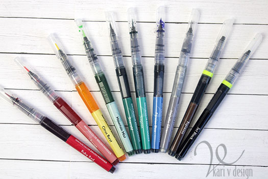
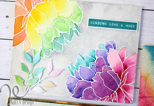
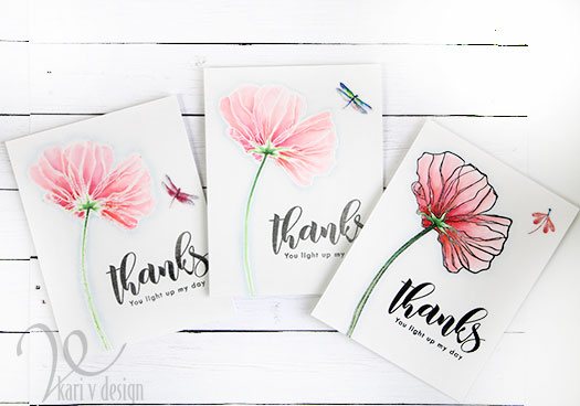
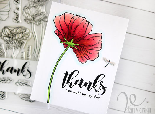
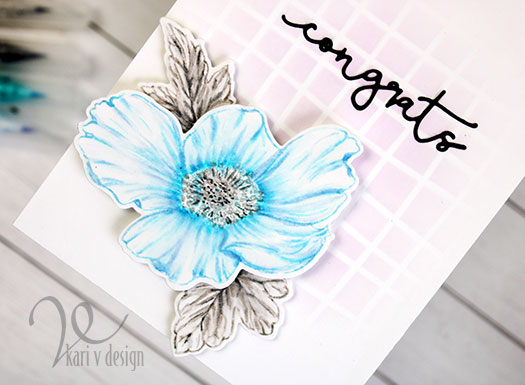
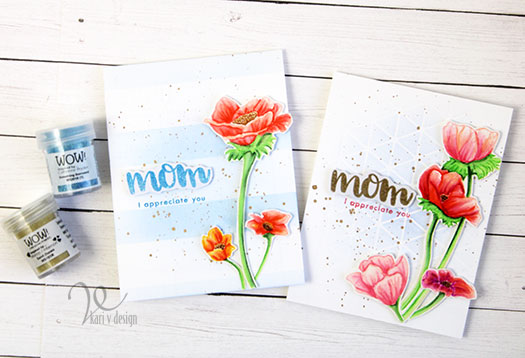
Part of the challenge was to color an image with a light or similar color ink to the image you are coloring. So I stamped out my images with a very light pink ink (rose blush from Altenew), then I colored them up with Zig Clean Color Real Brush Markers in pinks, reds, yellows and oranges.

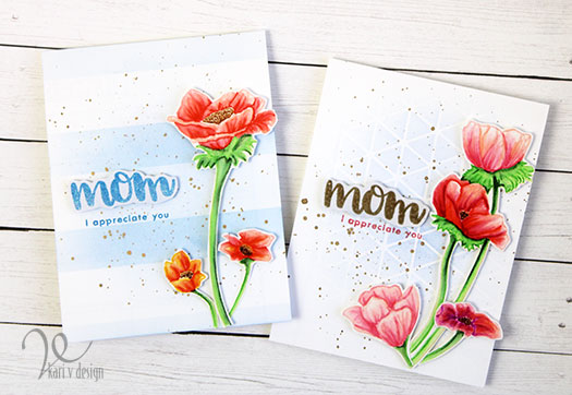
It’s almost like no-line coloring! I think they turned out so nice. I used bristol smooth paper to stamp the images, then cut them out.

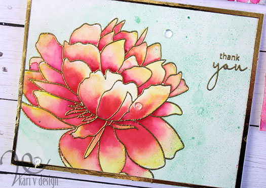
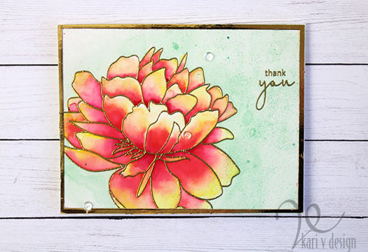
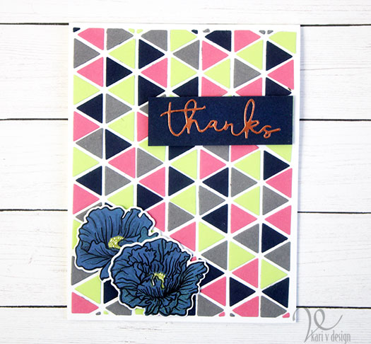
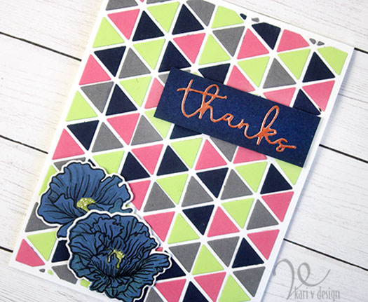
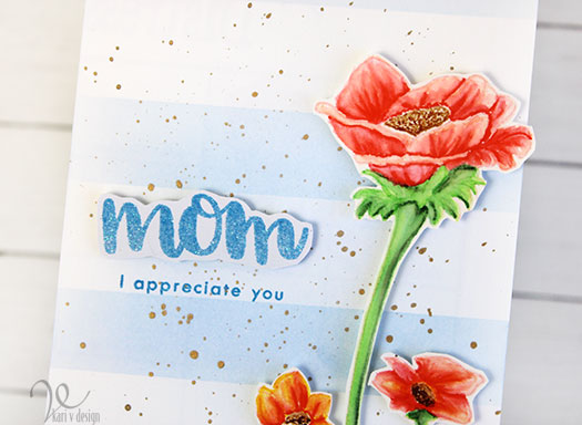
I had plenty of images to create two cards. I used the sentiment from the same set (masking off a portion so I only used “I appreciate you”) and added a mom sentiment that was heat embossed in gold and blue sparkle embossing powders.

Gold embossing powder with gold splatters

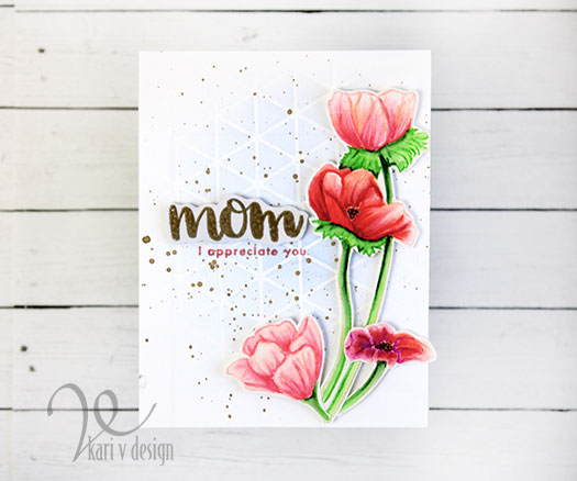
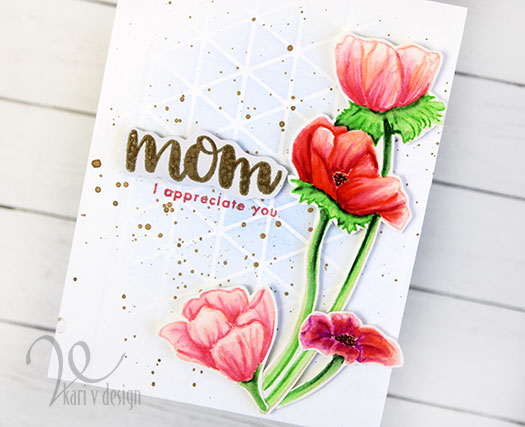
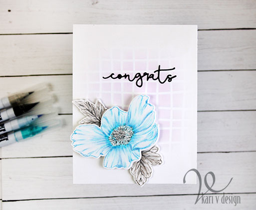
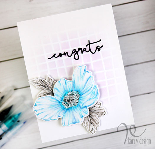
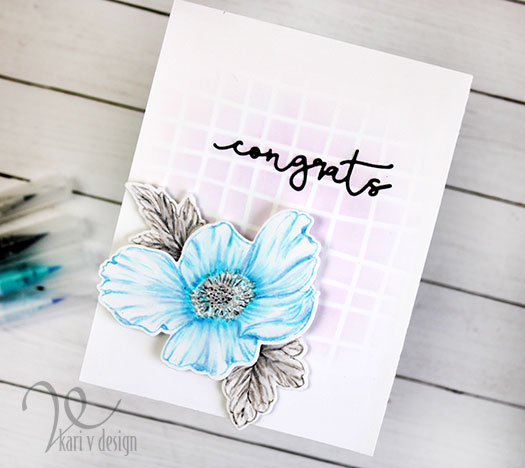
I inked up this background using a die cut as a stencil…this adds a bit of geometric to the floral card.

Flowers for Mom

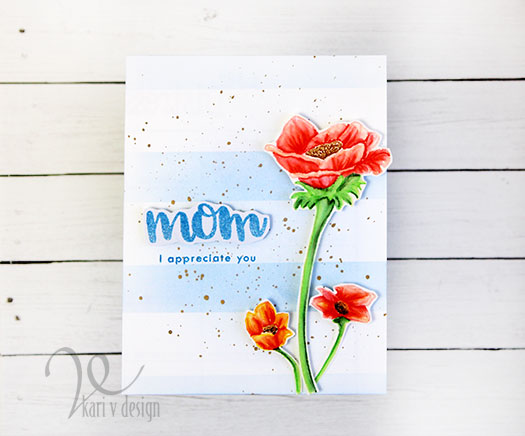
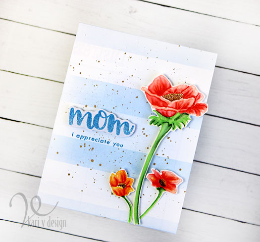
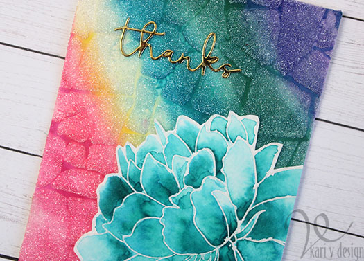
For this second card, I taped off the background using post-it tape and inked on a soft blue stripe. Gold splatters add a happy touch. I was inspired by the stripes and colors of the current Altenew Challenge so I will also enter this in the challenge for the month. See the beautiful blues, yellows and oranges?!

I’m often asked what supplies I use to make my cards and projects, so I’ve put together a list using affiliate links when possible. If you make a purchase with these links I may receive a small commission. These help me to keep up with blog costs and continue bringing you fun projects. Thank you so much for your support!

I hope you enjoyed these projects today! Have you made some mother’s day cards yet?

Comments { 2 }
peach-flower-1

Watercolor Brush Pens

Hello! Today I have some very BRIGHT cards for you, created using Watercolor Brush Markers from Altenew. I was quite surprised and amazed at the amount of pigment in these brush markers, and you will see that you can create some vivid, beautiful images with them!

This is a part of my AECP certification training, and I was inspired by the class called “Creative watercolor Media” taught by Jennifer Rzasa, Debbie Hughes, and Laura Bassen. I used quite of few of the techniques from this series: like watercoloring from a palette, watercoloring with sprays, and others.

Take a look at these cards! Those colors are amazing!

I create a video to share the three techniques I used, watch it below or on YouTube in HD:

For the first card, I used the wet-on-wet technique with watercolor paper. I heat embossed the image in gold, then used a waterbrush to add some water to a few of the petals. Then I added the color in. I let the water do most of the work and it turned into a brilliant flower! Wow!

Three colors blended together

For the background, I used a Metallic Spray to add color and splashes of interest.

On the second card, I used the watercolor pens direct to the watercolor paper and got amazing color. I put on some color from each of the markers, then blended with a brush and water to get a smooth look. So bright!

Glitz Glitter gel over the top to tone down the color

I used only ONE color on that big flower this time…so much depth. These pigments are just so good.

For the last card, I mixed colors together to get even more colors for my rainbow flowers.

I stamped the large flower on both corners of this card, and heat embossed in clear. Then I mixed some colors to get a nice rainbow spectrum. I finished off this card with some rainbow die cuts and a sentiment stamped in Lagoon ink to match the watercolor pens.

I’m often asked what supplies I use to make my cards and projects, so I’ve put together a list using affiliate links when possible. If you make a purchase with these links I may receive a small commission. These help me to keep up with blog costs and continue bringing you fun projects. Thank you so much for your support!

I really hope you enjoyed these projects, I challenge you to try out some watercolor brush markers and give these techniques a try!

Comments { 1 }
copic-colored-crooked

Lots of Color For Your Day

Hello! Today I am sharing a project for AECP inspired by the class called “Color Your Day” taught by Therese Calvird.

I was really inspired by day 5, where Therese talked about all the ways your coloring can look different…depending upon what medium you used, what ink you used, or what embossing you used. So I thought I’d give it a try!

I inked up one of my favorite flowers from the Wonderland Stamp set in a variety of ink & embossing powders. One in clear embossing powder, one in white, and one in black embossing…then I watercolored them with Zigs. Then I also inked one with Amalgam ink to color with Copics. Can you guess which one is which?

A color study…

This was an interesting color study, as different mediums and different inks really make a difference in the way the cards look.

Copic markers and Obsidian Amalgam Ink
Watercolored cards with Clear embossing, white embossing, and black embossing

I do think they have a different feeling, and I chose similar colors and coloring techniques to make them as similar as I could.

I used the same sentiments on all of them also, using some greys and black inks. (I thought the lighter cards needed a softer color sentiment, so I used gray ink).

I used a light blue color around each of the flowers to make it stand out more. I love the differences in these, and it was quite a fun study of color/mediums for cards.

I hope you enjoyed these projects today! Give it a try to see how your cards have a different feel with different mediums & embossing powders. It’s a fun exercise!

Thanks for stopping by today!

Comments { 1 }
geometric-thanks-sideways

Unusual Color Combinations

Hello! Today I have an unusual color combination to share. I was inspired by the Altenew class “With a Twist” taught by Therese Calvird. She challenged us to try a color combination that we don’t usually use.

So today I have a card using Navy, Stone, Peony, and Lime! This is a color combo I have NEVER used before. Oh, and I threw in some Rose Gold foil just for fun. It is so difficult to photograph foil, but the sentiments is made of Rose Gold.

For the background of this card, I pieced in the four colors of cardstock into the Layered Snowflake Stars Cover die B; then I removed the frame so it revealed the white cardstock underneath.

I put the colors in completely randomly. I think I like navy, peony, stone and lime together!

For the flowers, I used 2 darker navy Distress Oxides for the layers and Black ink as the outline layer. Then I used a lime ink for the center of the flowers.

I die cut the thanks from rose gold foil and adhered it onto navy paper. I popped up the sentiment strip and flowers with foam tape. I really love how these colors worked together. Grateful for AECP and this class for really pushing me to try some new things!

I’m often asked what supplies I use to make my cards and projects, so I’ve put together a list using affiliate links when possible. If you make a purchase with these links I may receive a small commission. These help me to keep up with blog costs and continue bringing you fun projects. Thank you so much for your support!

Thanks for stopping by today!

Comments { 1 }
beautiful-details-crooked

Beautiful Anemone

Hello, friends! Today I’m sharing a project that I have wanted to try for a while and I finally did! This card was inspired by the “Beautiful Details” class at Altenew Academy. This class is taught by Marika Rahtu and she is an inspiration! In one of the lessons, she stamped with Zigs on watercolor paper and added details with the same Zigs.

I was so in love that I wanted to try it myself. I love the way it turned out! Now, I know I need more practice, but I did take my time and spent quite a bit of effort….what do you think?

I only used four colors of Zigs for this project: Gray Tint, Gray Brown, Light Blue, and Shadow Mauve. I stamped the flower using the Shadow Mauve (I colored directly onto the stamp, then stamped it down using the Misti). Then I added details with the same color and then the light blue color.

For the center and the leaves, I used the Gray Tint and the Gray Brown. This took me some time as I kept adding layers and blending them out with my water brush.

I used the Wavy Grid stencil to add a subtle design to the background of the card. Then I popped up the flower with two layers of 3M foam tape, and the leaves with one layer of foam tape.

The last step was adding the congrats die cut sentiment to this card. I think the spacing on this die is perfect for this card.

I’m often asked what supplies I use to make my cards and projects, so I’ve put together a list using affiliate links when possible. If you make a purchase with these links I may receive a small commission. These help me to keep up with blog costs and continue bringing you fun projects. Thank you so much for your support!

I hope you enjoyed this project today! Thanks for stopping by.

Comments { 1 }