Archive | Paper Crafting RSS feed for this section
hope-card-1-no-supplies

Emboss a Layer

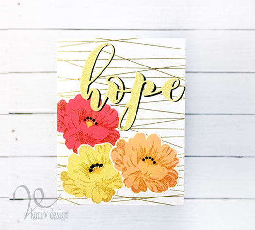
Hello! Today I’m excited to share a new technique (to me) with layering stamps. I stamped this beautiful flower and then heat embossed ONE of the layers to create a fabulous result!
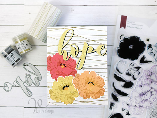
See that gold glitter layer?

First I stamped out the colors in fun sherbet colors (I’ve got summer on my mind!) and then I heat embossed a layer with this beautiful gold/tan embossing powder.
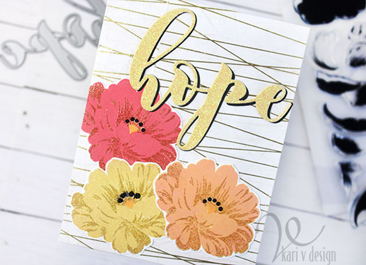
It adds such a fun layer of light glittery look to the flowers. I also black heat embossed the little stamens for a fun look.

To put this card together, I used some washi tape for the background and cut out the large hope sentiment with a yellow glitter paper and backed it with black cardstock.

Aren’t these flowers so beautiful?! I was inspired by the course “Impressive Heat Embossing” at Altenew…and I had one more technique I wanted to try. Svetlana Marchenko suggested trying clear heat embossing on a dark or colored background. So this next card does just that.
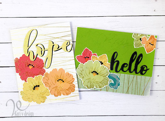
clear embossing on green background

I used the same florals and washi tape on this bright green Spring card…with clear embossing on the background. It is difficult to see in photos, but in real life it adds a fun element to the card.

For the hello sentiment, I heat embossed it with a dark grey embossing powder to finish it all off.

What a great class! I recommend it to anyone wanting some new, fresh heat embossing ideas for your cards. Thanks for stopping by!

I’m often asked what supplies I use to make my cards and projects, so I’ve put together a list using affiliate links when possible. If you make a purchase with these links I may receive a small commission. These help me to keep up with blog costs and continue bringing you fun projects. Thank you so much for your support!
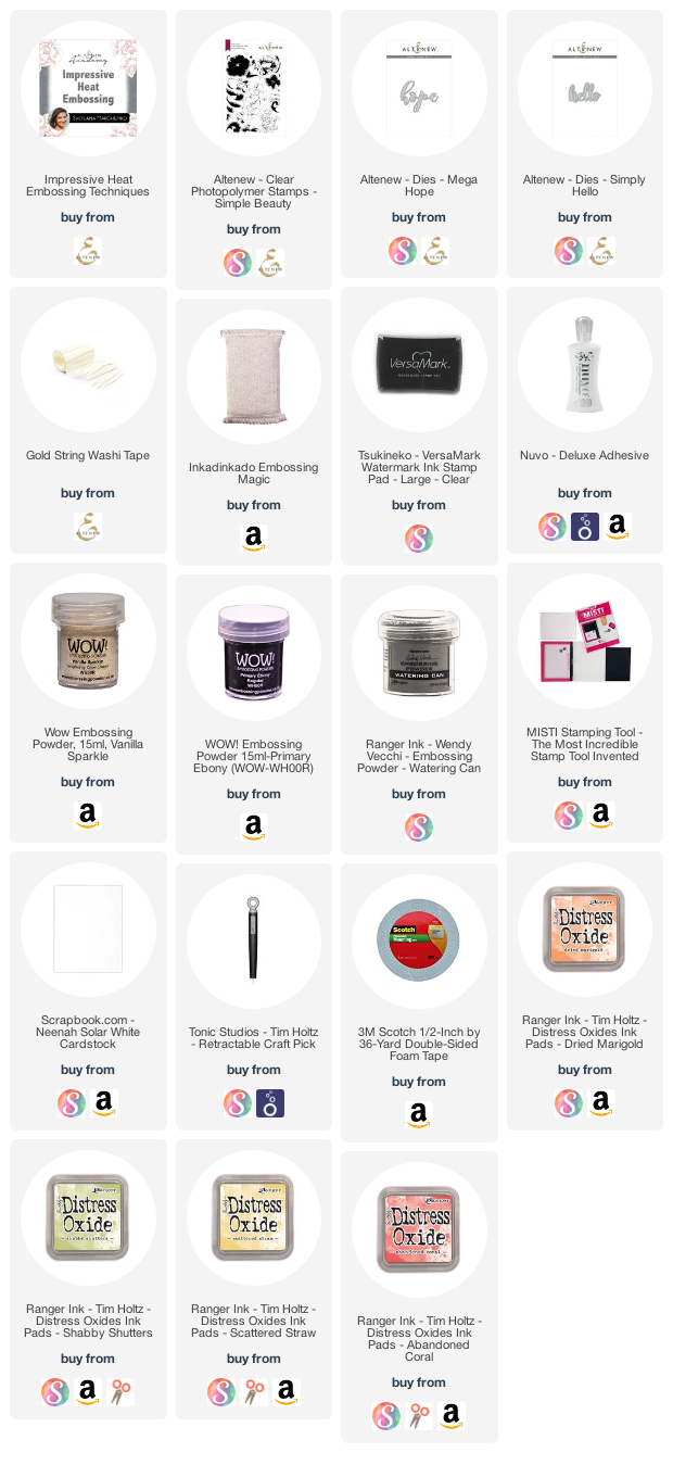
Hope you enjoyed these projects today! I appreciate you stopping by.
Comments { 1 }
SUNSHINE-silver-embossed-tools-only-2

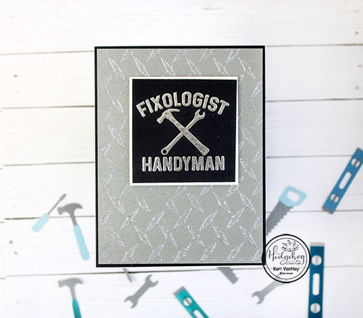
Masculine Tools – Cards for Men

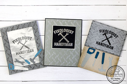
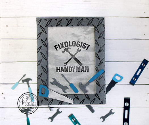
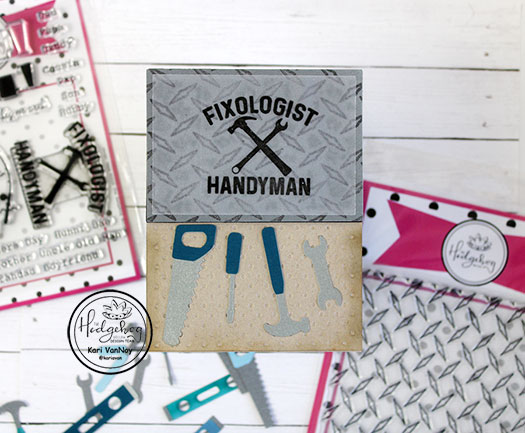
Hello! Today I have some masculine cards, with tools and all! I have three ideas for you using the April 2020 Hedgehog Hollow Kit.
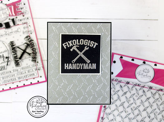
Today I’m using some fun techniques in my video: like the ink pad direct to paper technique to create the fun silvery background.

Metallic silver ink pad creates a stunning background

I’m also sharing my FAVORITE way to adhere vellum without seeing any of that adhesive. And an embossing folder to create a peg board look.

Watch the video below or on YouTube:

I’m often asked what supplies I use to make my cards and projects, so I’ve put together a list using affiliate links when possible. If you make a purchase with these links I may receive a small commission. These help me to keep up with blog costs and continue bringing you fun projects. Thank you so much for your support!

Which one is your favorite? Thanks for stopping by today!

Comments { 0 }
peach-flower-1

Watercolor Brush Pens

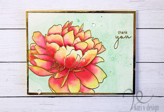
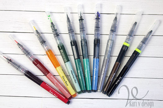
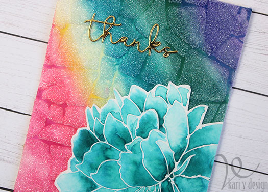
Hello! Today I have some very BRIGHT cards for you, created using Watercolor Brush Markers from Altenew. I was quite surprised and amazed at the amount of pigment in these brush markers, and you will see that you can create some vivid, beautiful images with them!

This is a part of my AECP certification training, and I was inspired by the class called “Creative watercolor Media” taught by Jennifer Rzasa, Debbie Hughes, and Laura Bassen. I used quite of few of the techniques from this series: like watercoloring from a palette, watercoloring with sprays, and others.

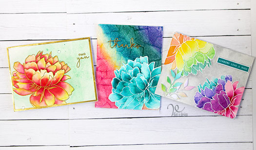
Take a look at these cards! Those colors are amazing!

I create a video to share the three techniques I used, watch it below or on YouTube in HD:

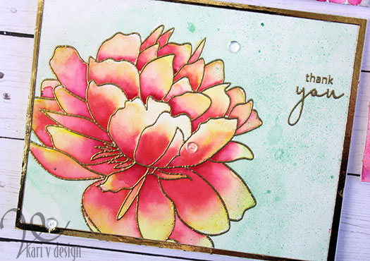
For the first card, I used the wet-on-wet technique with watercolor paper. I heat embossed the image in gold, then used a waterbrush to add some water to a few of the petals. Then I added the color in. I let the water do most of the work and it turned into a brilliant flower! Wow!

Three colors blended together

For the background, I used a Metallic Spray to add color and splashes of interest.

On the second card, I used the watercolor pens direct to the watercolor paper and got amazing color. I put on some color from each of the markers, then blended with a brush and water to get a smooth look. So bright!

Glitz Glitter gel over the top to tone down the color

I used only ONE color on that big flower this time…so much depth. These pigments are just so good.

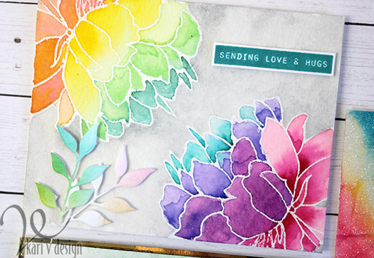
For the last card, I mixed colors together to get even more colors for my rainbow flowers.

I stamped the large flower on both corners of this card, and heat embossed in clear. Then I mixed some colors to get a nice rainbow spectrum. I finished off this card with some rainbow die cuts and a sentiment stamped in Lagoon ink to match the watercolor pens.

I’m often asked what supplies I use to make my cards and projects, so I’ve put together a list using affiliate links when possible. If you make a purchase with these links I may receive a small commission. These help me to keep up with blog costs and continue bringing you fun projects. Thank you so much for your support!

I really hope you enjoyed these projects, I challenge you to try out some watercolor brush markers and give these techniques a try!

Comments { 1 }
nurse-close-up

Nurse Appreciation

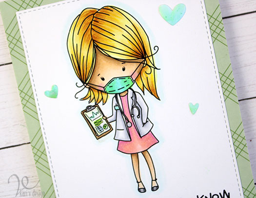
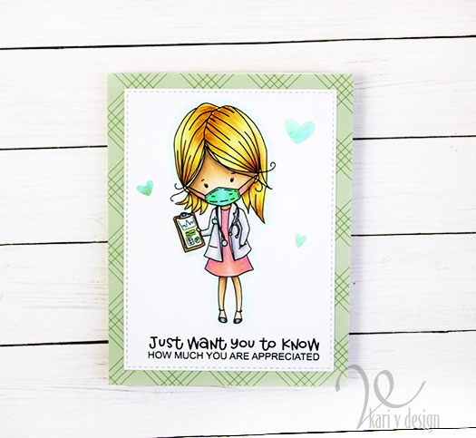
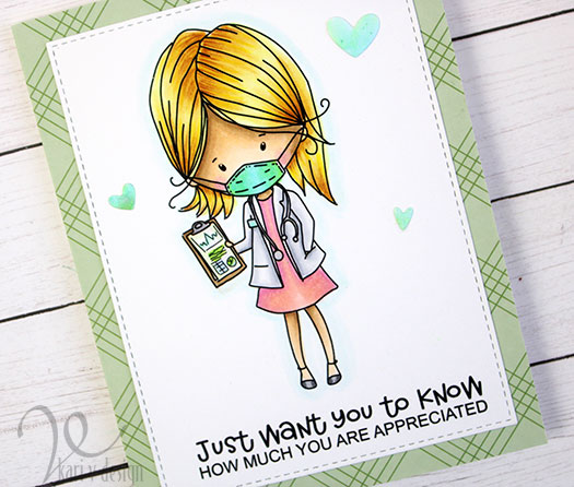
Hello! Today I have some cute cards to show appreciation for nurses (and doctors) and medical professionals. This image is currently a free digital stamp from Polkadoodles, click here to find it and download the bundle for yourself.

You are appreciated

Isn’t she cute? I colored her up with Copic Markers, trying some new combinations. It’s all a part of the Daily Marker 30 Day fun!

I die cut the main panel with a stitched border, and added it to a green plaid patterned paper. Then I added a few hearts in different sizes.

If you want to color this image up yourself, go get this digi while it lasts! And a BIG THANK YOU to all our front-line workers who are helping in important ways. Stay healthy!

Thanks for stopping by!

Comments { 0 }
copic-colored-crooked

Lots of Color For Your Day

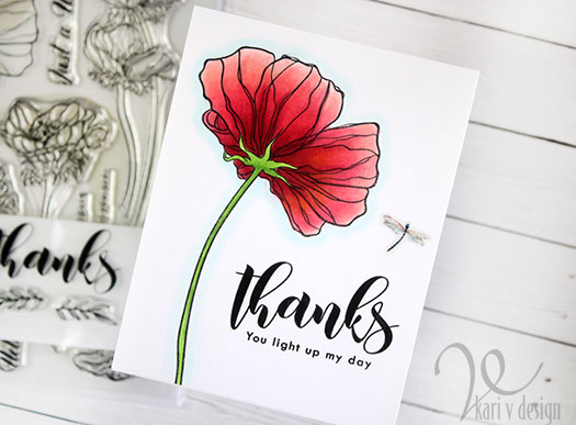
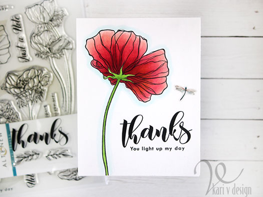
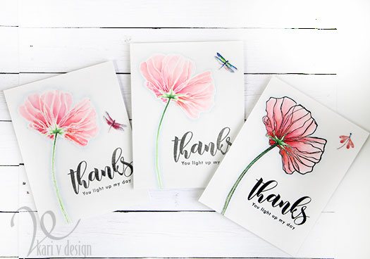
Hello! Today I am sharing a project for AECP inspired by the class called “Color Your Day” taught by Therese Calvird.

I was really inspired by day 5, where Therese talked about all the ways your coloring can look different…depending upon what medium you used, what ink you used, or what embossing you used. So I thought I’d give it a try!

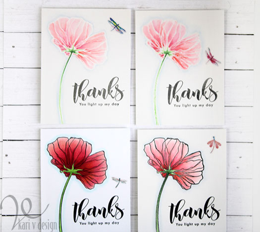
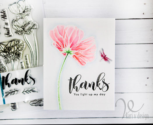
I inked up one of my favorite flowers from the Wonderland Stamp set in a variety of ink & embossing powders. One in clear embossing powder, one in white, and one in black embossing…then I watercolored them with Zigs. Then I also inked one with Amalgam ink to color with Copics. Can you guess which one is which?

A color study…

This was an interesting color study, as different mediums and different inks really make a difference in the way the cards look.

Copic markers and Obsidian Amalgam Ink
Watercolored cards with Clear embossing, white embossing, and black embossing

I do think they have a different feeling, and I chose similar colors and coloring techniques to make them as similar as I could.

I used the same sentiments on all of them also, using some greys and black inks. (I thought the lighter cards needed a softer color sentiment, so I used gray ink).

I used a light blue color around each of the flowers to make it stand out more. I love the differences in these, and it was quite a fun study of color/mediums for cards.

I hope you enjoyed these projects today! Give it a try to see how your cards have a different feel with different mediums & embossing powders. It’s a fun exercise!

Thanks for stopping by today!

Comments { 1 }