Tag Archives | AECP
hibiscus-hope

Spotlight Die Cutting and Ink Blending

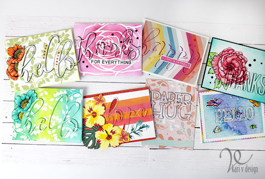
Hello! Today I have another one of my very favorite techniques to share with you called spotlight die cutting! I’m pairing it with some ink blending techniques today for some very fun and bright cards.

Here’s a look at all of my cards:
I am so excited to be a guest over on Justine Hovey’s YouTube Channel to show you just how to do this so check it out below or on YouTube!

This technique is so fun and really easy once you know some of the shortcuts. I share lots of variations and ideas in this video, so I hope you will check it out!
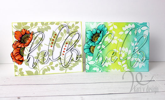
These ink blended cards (the blue hello card on the right and the hope card below) are inspired and a part of my Altenew AECP certification classes, Easy Ink Blending Techniques. Ink blending over embossing is definitely a favorite of mine, as shown on the blue/green card above. I first stamped the leaves with VersaMark ink, then added clear embossing powder over the top. I heat set that with my heat gun and then blended on the ink over the top. To make the leaves really pop, wipe the excess ink off the embossed images with a clean towel.
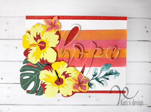
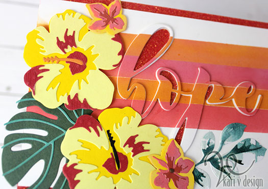
For this hope card, I masked off some stripes and ink blended with Distress Oxides and a makeup brush until I got a soft, smooth blend. Then I die cut the hope after this was all done. Those hibiscus are just gorgeous, aren’t they?! And the glitter tape adds just a bit of extra pop!
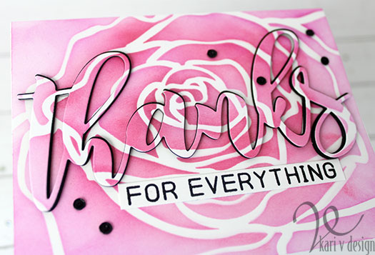
This Mega Rose stencil is a fun one for ink blending over. Here I used two different colors of Distress Ink to get the variation of color. So easy to do and it adds quite a pop!

I’m often asked what supplies I’ve used on my cards, so I’ve compiled a list for you, using affiliate links when possible at no extra cost to you. When you make a purchase through these links, I may receive a small commission. These help me to keep up with blog costs and continue to bring you fun projects like this one! Thank you so much!
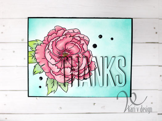
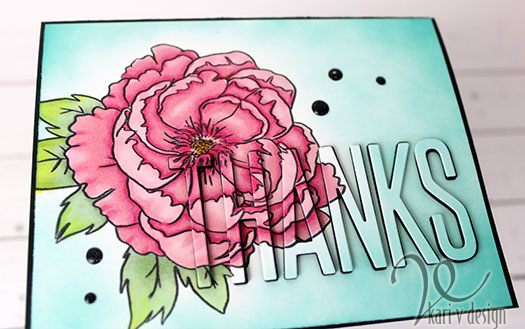
A BIG THANKS for stopping by and watching my video. Which card is your favorite?

Comments { 1 }
both-cards-2

Stenciling on a Stencil?

Hello there! Today I’m inspired by Laurel Beard’s Stenciling Techniques class over at Altenew classes. She has the best ideas in this class, some I’ve never tried before!

She also had a suggestion to do a stencil overlay on a watercolor background. Well, it got me thinking. What if I did a stencil overlay over ANOTHER stencil? That sounds fun!

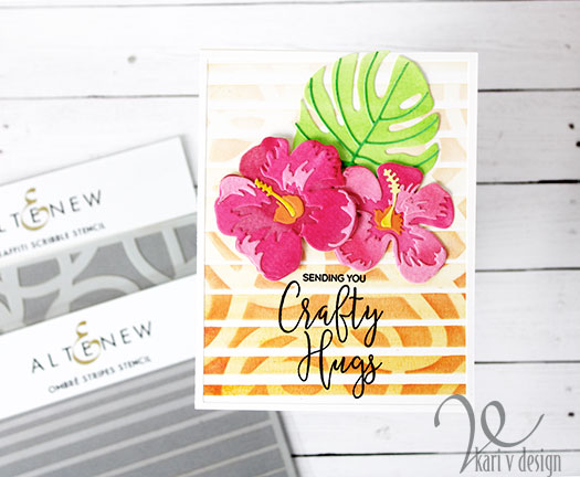
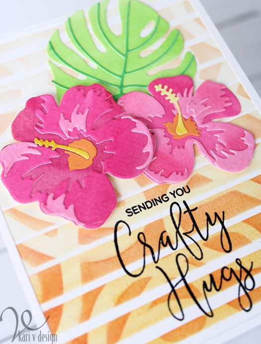
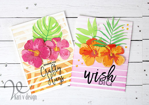
So I got out two of my favorite stencils from Altenew and first I added the Ombre Stripes Stencil to my background using Spiced Marmalade Distress Ink. Then I added the Graffiti Scribble stencil right over the top and inked on some Picked Raspberry Distress Ink. Guess what?!? It worked!

Sending you Crafty Hugs!

The sentiment is from another of my favorite Altenew sets! Such a great sentiment for a card. (This one is going to a crafty friend).

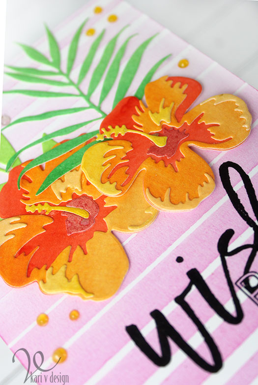
I added some Hibiscus flowers that I die cut from watercolored panels. I used Gansai Tambi watercolors to get a very vibrant look. When I watercolored up my panels…I did them in a sort of Ombre fashion, with a darker pink at the top and a lighter pink at the bottom. Then I die cut my hibiscus so that the top layers would be the lightest. I did the same with the orange flowers (see below). I think these flowers look so pretty out of watercolored paper.

You can see a little texture from the watercolor paper

I found that for this technique, I like using a stencil brush…it’s so easy to spread on the color without affecting the stencil. I just lightly brush back and forth from one side to the other (starting and ending OFF the sides of the paper) until I get the shade I want. In this case, I blended the Picked Raspberry over the Spiced Marmalade and it gave me a darker orange color. Pretty neat.

I glued down the flower and Monstera leaf with liquid glue, and popped up the top hibiscus flower with foam tape.

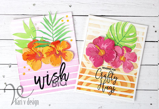
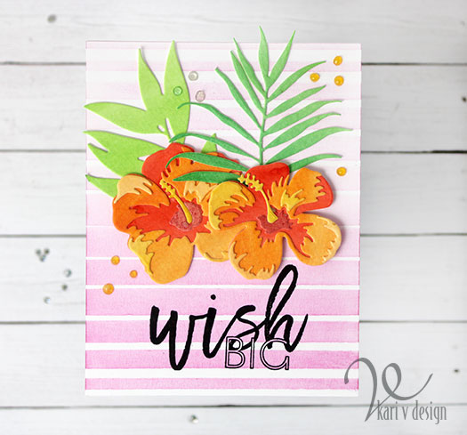
I also created a card just using the Ombre Stripes Stencil alone, to give you a perspective of what the layering does to the card.

One stencil used on the left, two stencils used on the right

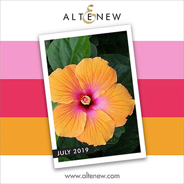
I think it adds quite a bit when you layer the stencils! I made the card on the left first for my sister’s birthday card and then I tried the two stencils for the card on the right. Can you guess that the design and color scheme was inspired by the July Altenew challenge?

Lol. I love entering these challenges and I have a lot of fun with them. For this card, I added some Nuvo Jewel drops to complete the look. [I didn’t think the double stenciled card needed the extra drops since it already had so much interest!]


You can see some of the watercolor splatters on the middle of this hibiscus

I’m often asked what supplies I’ve used to create my cards, so I’ve compiled a list for you using affiliate links, when possible. If you purchase product with these links I may receive a small commission. I appreciate this so much, as this helps me to keep up my blog and continue to bring you fun projects! Thank you very much.

I hope you enjoyed these projects today. I am really loving these florals and stencils so much right now. See you next time!

Comments { 4 }
altenew-july-challenge

How to get a Watercolor Look on Cards

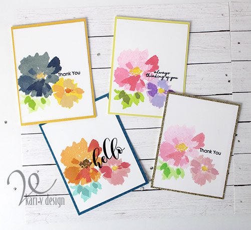
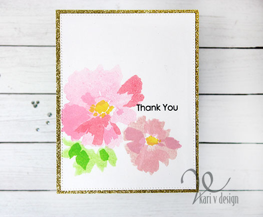
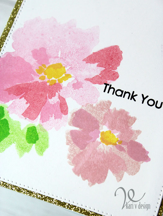
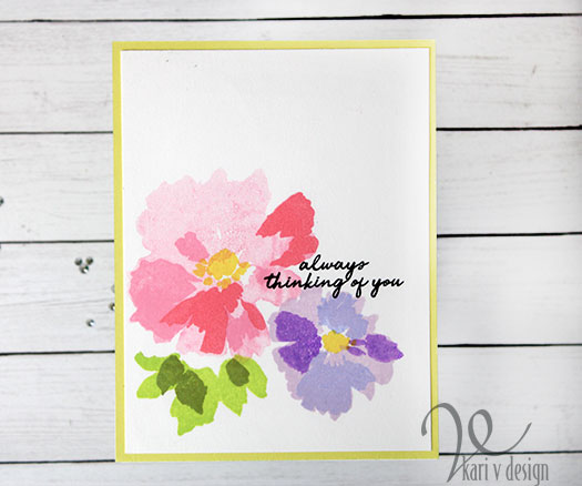
Hello! I’m excited today to share with you some watercolor looking cards. Now, I did not actually watercolor these, however I did do a technique where I inked up the stamp then misted it with water to get this dreamy look!

I was inspired by Nicole in her All About Layering 1 course, she liked to use colorful, inked florals with a black sentiment. I love that look, so I thought I’d give it a try with a variety of sentiments!

For this one I used a gold glitter frame to make it pop.

Watercolor spritz

I decided to make a whole bunch of cards using different colors of florals. Since I had the stamps all set up in my MISTI, why not?

To make it easy on myself, I usually set up the layers in my original MISTI so I have room enough to put two stamps on at a time. Then I stamp in assembly- line style, changing up the colors as I want. That’s how I made a whole bunch of these floral panels at the same sitting.

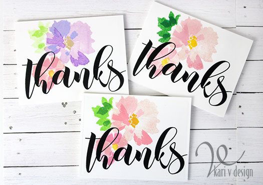
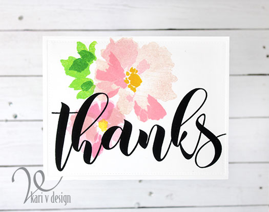
For the next cards, I went with a bold sentiment….just for fun! I really love how they turned out, and I’m always in need of thank you cards.

Big Thanks!

I just turned these onto the side/horizontal layout to fit that big thanks word on the card panel. For large sentiments like this I am sure to use my MISTI (or stamp positioner) just in case I need to stamp it twice to get that dark, crisp black sentiment. Love it! You can see I experimented with a lot of green inks on these…still need to find my perfect green combo.

a different color combo

This color combo was inspired by the current July Altenew Challenge!

Always thinking of you

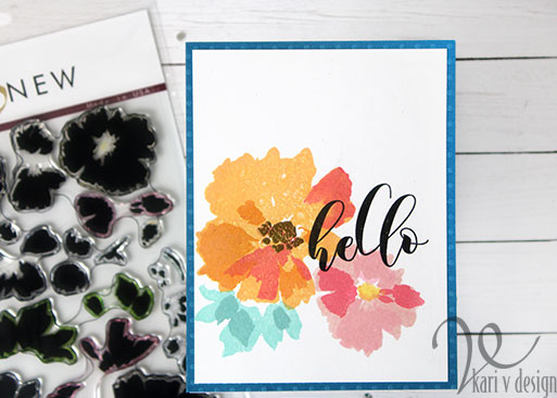
The inking may not be perfect, but that is some of the joy of watercolor stamping (using a spritz of water)! Keep in mind that if you use Distress Oxides for this, they dry with a more chalky look (as one of those purple colors above…also on the yellow and dark blue flower in the very first picture).

Thanks for stopping by! I’m often asked what products I used, so I have a list for you below, using affiliate links when possible. When you purchase product using these links I may receive a small commission. These really help in keeping up with blog costs and allow me to bring more fun projects like this one! Thanks so much!

Comments { 5 }
both-cards-2

Life Looks Beautiful on You

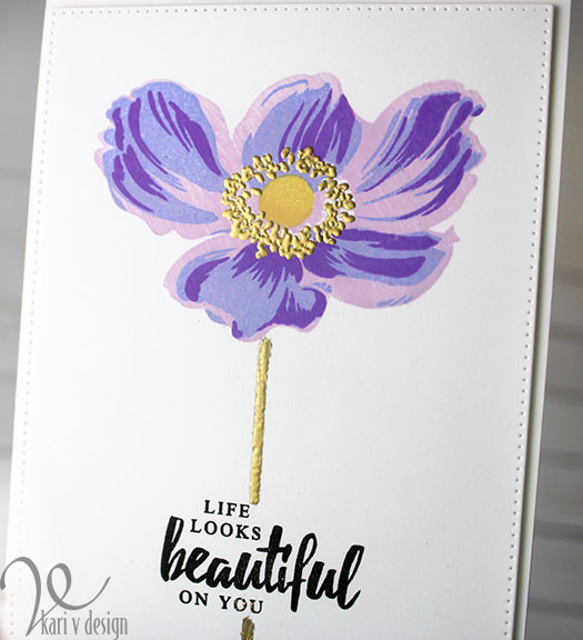
Hello! Today I have another card share for my Altenew Educators Certification Program. This time, I was inspired by Jennifer Rzasa in the Clean & Simple Boutique Cards class.

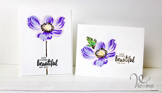
Clean & Simple definitely does not come easy for me, but Jennifer suggested adding a little something extra like foil or embossing powder. This gives the card a bit more flair and still remains clean & simple.

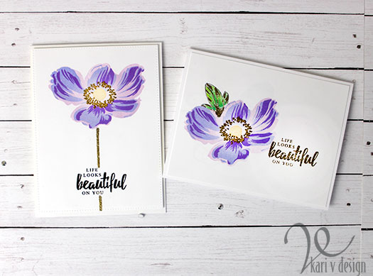
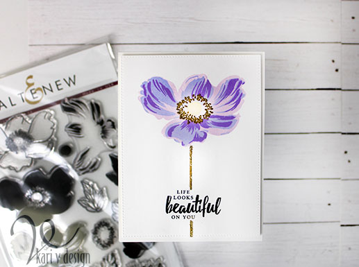
Here’s my take, (it is difficult to capture the shine of the gold in photos, so please keep scrolling for more pictures):

I just love the look of this stamp set (Build-A-Flower: Anemone)! I used a variety of purple inks to get this look. Since I don’t have my Altenew inks yet, I combined both Distress Ink and Distress Oxides to get this look.

The idea was to add a gold embossed stem to the Anemone, but this stamp set doesn’t have any stems, so I drew one on using a Versamarker!

Gold embossing powder adds a pop of shine

I have a video below to show you the process, or watch on YouTube:

Just imagine all the different color combinations you can try on this flower. I love the big change in colors I got here, but for a more subtle effect you could simply use one or two colors and double, even triple stamp in that color.

I hope you enjoyed this project today. I often get asked what products I’ve used, so I have a list below. I use affiliate links, when available, at no extra cost to you. When you purchase using these links, I may receive a small commission. This helps me to keep up with blog costs and continue to bring you projects like this! Thanks for your support.

Love this Anemone set! Thanks so much for stopping by.

Dramatic Anemone
Comments { 4 }