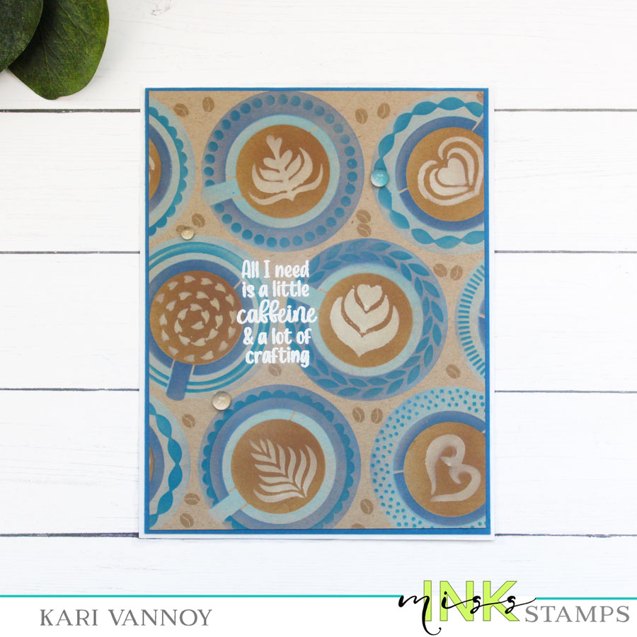
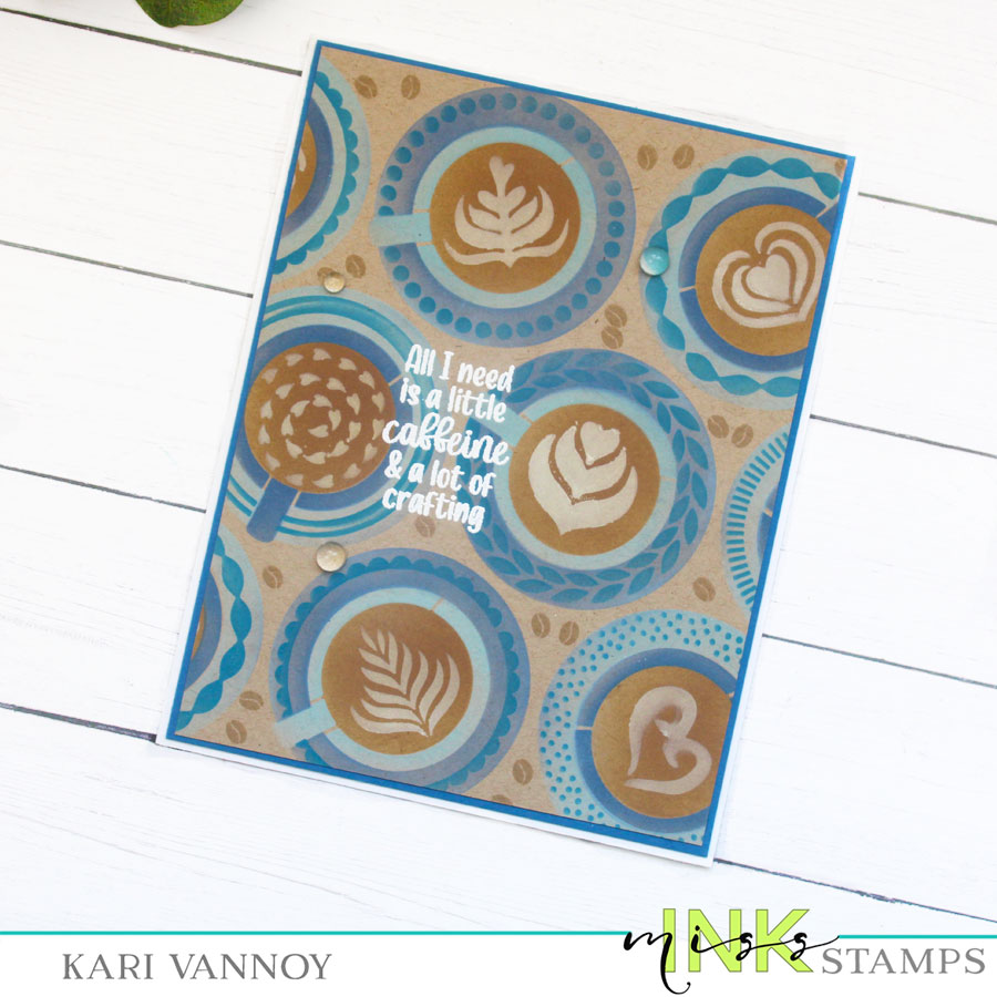
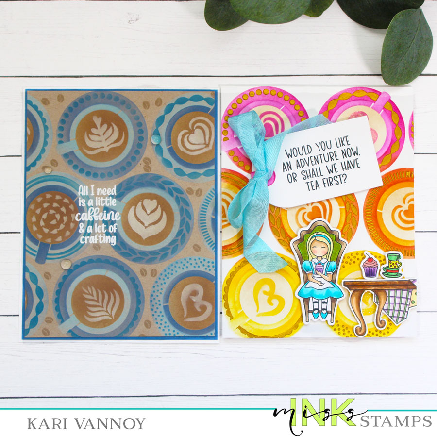
Hello, today I have two cards to share with different Latte Art Looks. This new Latte Art Layering stencil is from Miss Ink Stamps and it’s so beautiful!
For this card, I started with kraft cardstock and used some Distress Oxide inks in shades of blue. Oxide Inks show up much better on kraft cardstock since they sit on top of the paper.
I used white pigment ink for the designs in the latte, and white embossing powder for the sentiment (from the Caffeinated Stamp set). Those coffee beans that are stamped on the background are from the same stamp set.
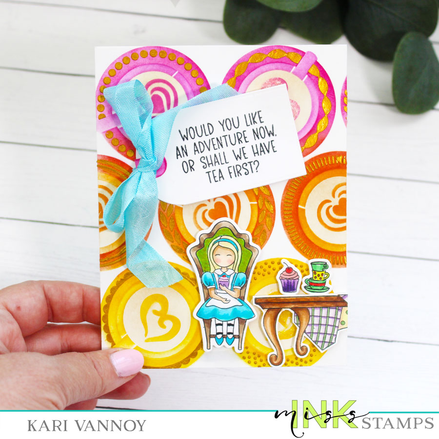
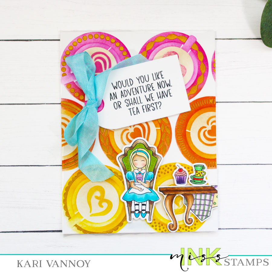
For this second card, I started with white cardstock and some very vibrant Dye Inks in pink, orange, and yellow. Then I brought in some gold Lunar Paste for the final layer to add some shine and texture!
I made the “liquid” a lighter brown to look like tea, and of course I had to invite Alice to the Tea Party!! 🙂
I’m often asked what supplies I use to make my cards and projects, so I’ve put together a list using affiliate links when possible. If you make a purchase with these links I may receive a small commission. These help me to keep up with blog costs and continue bringing you fun projects. Thank you so much for your support!
One stencil, two cards, two very different looks! Did you enjoy this project today?! I had a great time creating these. I’ll be back real soon to share more cards.
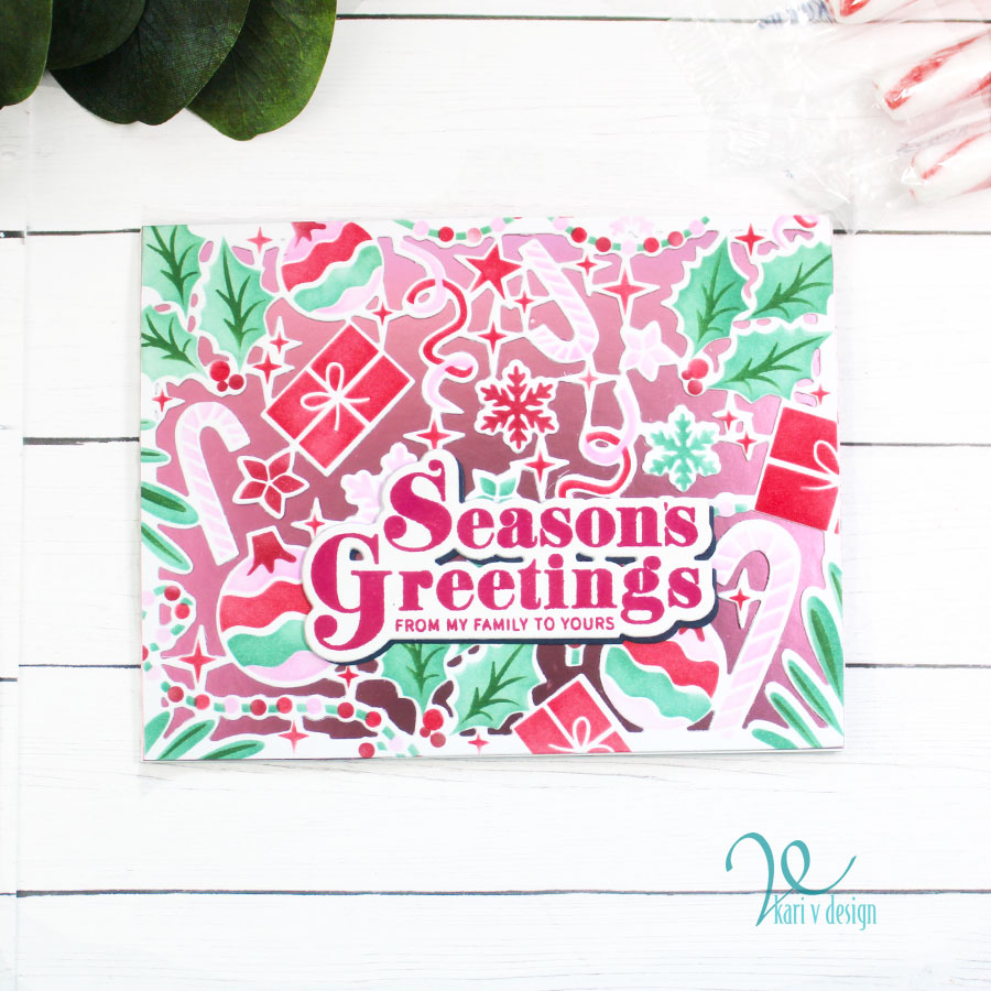
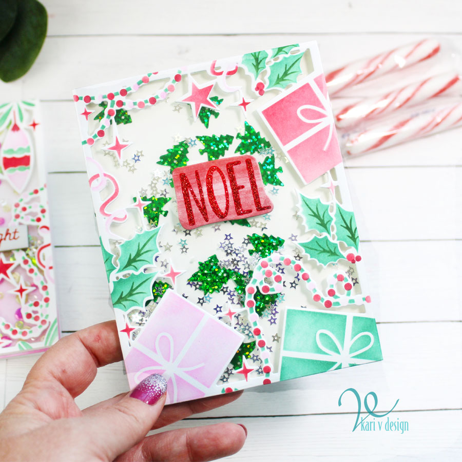
Hello! Today I have a fun video sharing a new (to me) way to Step Up Your Stenciling! Watch the video below or in HD on YouTube:
The large stencil I’m using today is from The Ton and it will cover an 8 1/2 x 11″ cardstock!! Then you can cut them down to make 4 cards.
But the amazing NEW product is this die set that coordinates! You can cut each panel and that allows you to create a shaker card, or put some sparkly/metallic paper behind the panel. AMAZING!!
I just love this set…watch the video to see how it works!
I’m often asked what supplies I use to make my cards and projects, so I’ve put together a list using affiliate links when possible. If you make a purchase with these links I may receive a small commission. These help me to keep up with blog costs and continue bringing you fun projects. Thank you so much for your support!
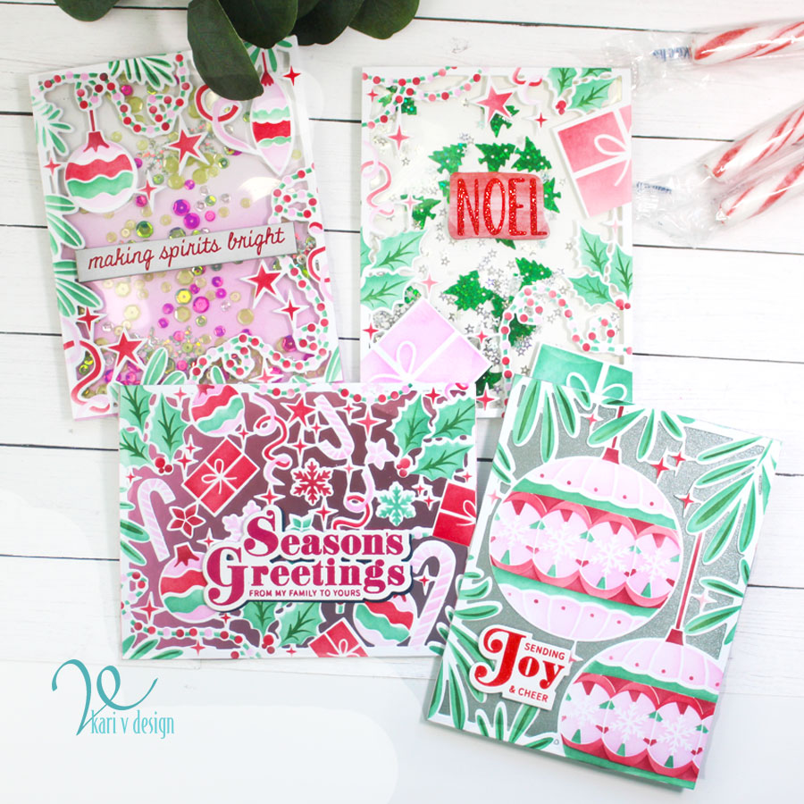
I hope you enjoyed these projects today! Have a very Happy Holiday Season!
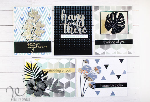
Hello! Today I have a secret to share with you: it’s my formula for making masculine cards. This is also a part of my FINAL for Level 2 of the Altenew Educator’s Certification Program (AECP).
The Final Challenge was to create 4 Masculine Cards using 3 components of the techniques I learned in Levels 1 & 2 of the AECP. The components I chose were:
Stencil Techniques
Impressive Heat Embossing
Let It Shine
I also pulled together 3 masculine themes (metallic, nature, & geometric) and 3 colors to create all of my cards. I get a lot of questions on how I create Masculine cards, so today in my video I’m sharing my SECRET FORMULA for making Masculine cards (it’s not a secret anymore)! Watch the video below to find out the formula I use, or watch it in HD on YouTube:
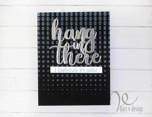
For my first card, I used some stencil techniques: inking with Distress Oxide on dark cardstock & offset stenciling. I used the Halftone stencil to ink on some of the new Speckled Egg Distress Oxide ink, then let it dry. Once it was dry, I offset the stencil just a bit to add some Versamark sticky ink and added some Distress Embossing Glaze & heat set that. The embossing glaze is translucent so you can see through to the inking, but it gives a shiny element to the background. (So neat!)
I also created a temporary “holder” to emboss that die cut sentiment three times. This holder was so helpful so I didn’t burn my fingers or get any tweezer marks in my silver embossing!
The sentiment adds a metallic look for the “Let It Shine” inspiration on this card! I love a metallic element on a handmade card. I stamped the subsentiment with the same Speckled Egg Distress Oxide and popped it up with foam tape.
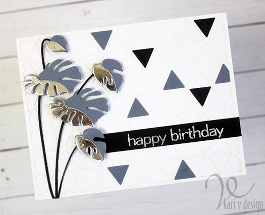
For my second card I die cut a cover die and adhered it to a white card panel…then I filled in a few of the spots with colored cardstock to get that geometric look!
Layered Monstera Leaves give this card a 3D look
I die cut some monstera leaves in steel gray and silver metallic (for that shine)! Then I popped them up with foam squares. To match with the silver theme, the sentiment is heat embossed in silver. This card turned out to be my husband’s favorite card of them all!
For the third card I’m bringing in some selective stenciling! First I stenciled the entire background in Speckled Egg Distress Oxide, then I added a darker blue to just a portion of the stencil. To the very smallest portion, I added some Glacier Paste in Quicksilver for some shine (it dries to look like foil)!
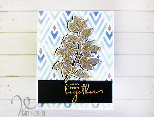
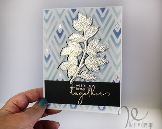
We are better together
For the leaves, I heat embossed it TWICE. Once with a silver embossing powder, then I stamped the dots in Versamark and embossed with a gold embossing powder. This is a neat technique, as the embossing powders kind of melt into each other. I think this is a great look!
Stencil techniques, Embossing techniques, and Let It Shine Techniques are glorious together!
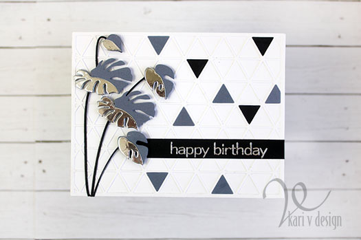
For my fourth card, I created a geometric background using the Cube Builder Stencil. I spaced the cubes apart just a little and gave them more of a “chevron” appearance, using colors I chose for the theme, but adding in a bit of Antique Linen. It turned out a little more yellow than I expected, but that just added a sunny, happy look.
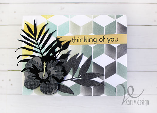
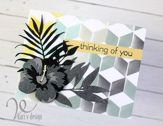
Flowers and leaves in gray, black, and metallic
I die cut some leaves and one hibiscus using black, gray, and metallic papers. This adds a more masculine feeling. (Don’t you want to take a trip to Hawaii now?) I stamped the sentiment on a strip that I inked with Antique Linen Oxide to match.
Now, if the flower is a little over the top for you (my husband does like flowers, but it’s not for every man!), I made a variation of this card omitting the hibiscus flower.
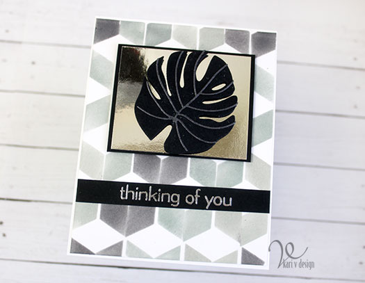
It’s the same stencil background, using only black and gray inks. Then I added a metallic paper focal point with a black frame to the middle. The monstera leaf is popped up with foam squares to give even more dimension.
So there you have 5 masculine cards, using 3 Techniques, 3 Themes, and 3 Colors (mostly)! It’s a fun challenge to take, and I hope you enjoyed the process with me.
I’m often asked what supplies I use to make my cards and projects, so I’ve put together a list using affiliate links when possible. If you make a purchase with these links I may receive a small commission. These help me to keep up with blog costs and continue bringing you fun projects. Thank you so much for your support!
I completely enjoyed my experience with the Altenew Educator’s Certification Program! I highly recommend it to you if you are interested in learning a lot of techniques, getting better at cardmaking, and teaching techniques to others.
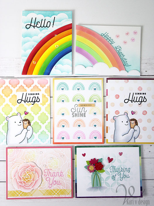
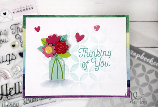
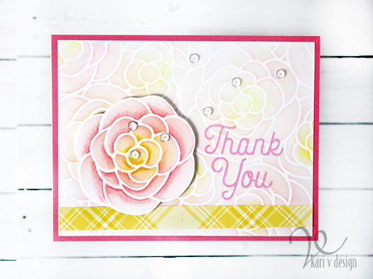
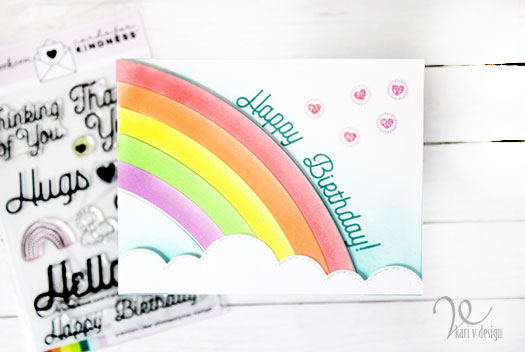
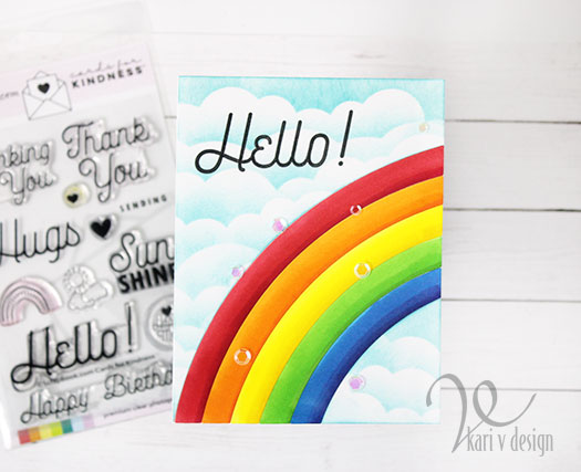
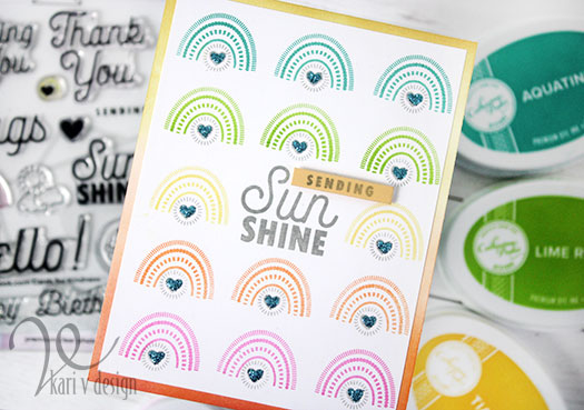
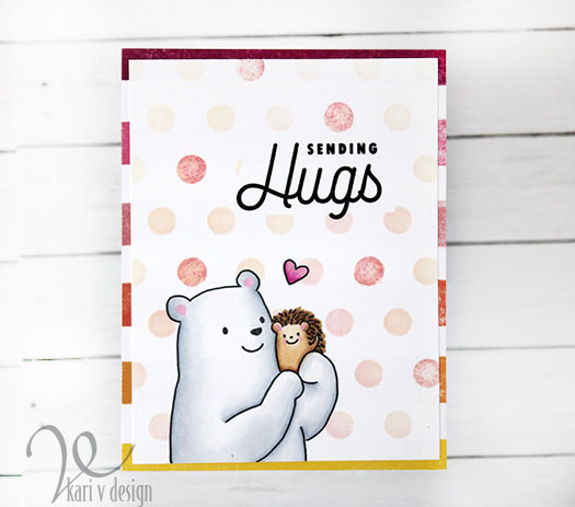
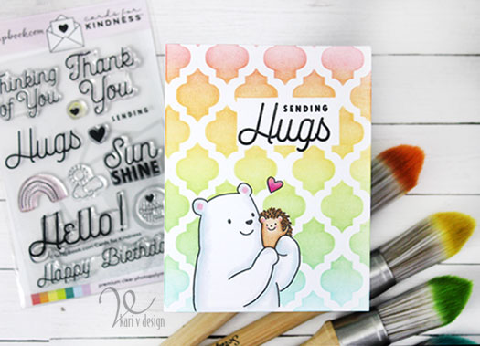
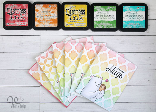
Hello! Today I am sharing the best new stamp set I’ve seen for this time. It’s called Cards for Kindness and it’s by Scrapbook.com. I love ALL the sentiments and icons in this set, and of course I couldn’t stop at just ONE card! Lol.
Scrapbook.com is now collecting cards for their Cards for Kindness Drive, please click here to read more about what they need! If you are a cardmaker, they need YOUR help!
Here’s a look at all 7 cards I’ve made so far with this set. As I said, I LOVE ALL the sentiments in this set. So you can bet I have more cards on the way!
I have a video to share, showing you TWO card ideas and the entire stamp set. View it below or on YouTube:
Have I mentioned that I love this set? Check out the set below in the supply list and all the supplies I’ve used.
I’m often asked what supplies I use to make my cards and projects, so I’ve put together a list using affiliate links when possible. If you make a purchase with these links I may receive a small commission. These help me to keep up with blog costs and continue bringing you fun projects. Thank you so much for your support!
I hope you enjoyed these bright, kind cards for today. Don’t forget to check out the Cards for Kindness campaign…there are so many people who need a cheerful card!
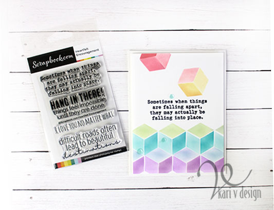
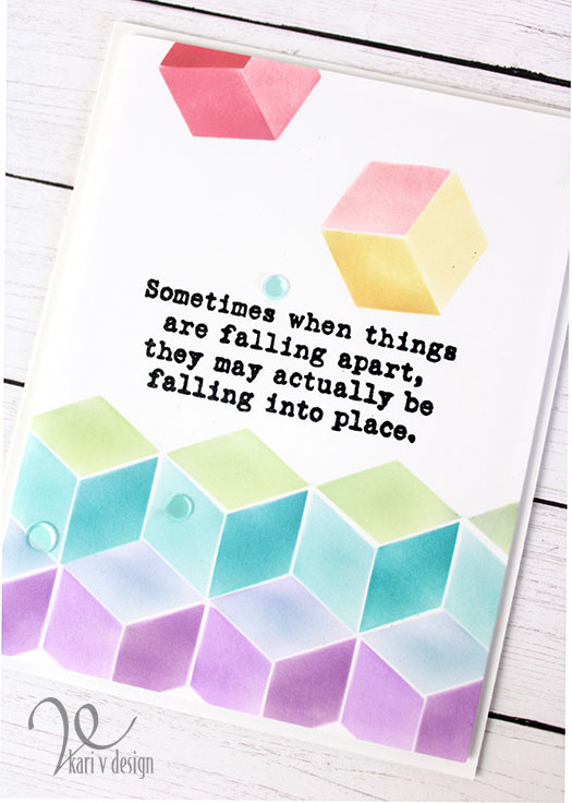
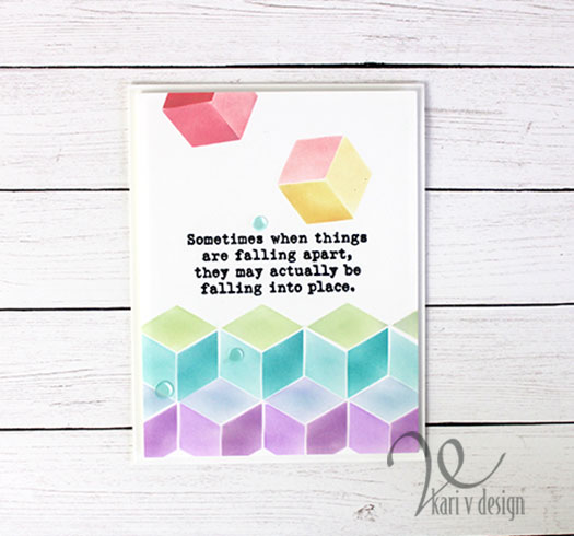
Hello! Today I have a card that is very much perfect for the year I’ve had. I created this card all around the most beautiful sentiment that says: “Sometimes when things are falling apart, they may actually be falling into place.”
Wow. What a great way to look at things. Here is the card I created with this sentiment.
I love this sentiment so much. Some of you know, but not many, that I was experiencing lots of pain in my hands and my neck that started last year. And this year, after many tests, x-rays, MRI, and doctors visits I was told by 2 different doctors that I had a life-threatening condition in my neck. It was caused by a chiropractor who cracked my neck in a way that my neck did not like!
I am now in physical therapy and other therapies to help alleviate the pain and get my neck back into the correct position. However, it takes time and there is no quick fix.
I did not mean to make this post about my physical challenges, but this sentiment sure makes me think about what this situation could really mean for my life.
Falling into place….
I love this sentiment together with this stencil. I have a video on using this stencil and how it all came together. Watch it below or on YouTube:
I am grateful for the time I have to craft (even when it’s painful) and for the time I have to learn. I love how creating cards can be so healing and happy for me.
I have put together a list of the products I used on this card, in case you are interested. I use affiliate links when I can, and when you purchase using these links I may receive a small commission (at no additional cost to you). These little bits help me to keep bringing you projects and videos; and they also help to pay for my physical therapy costs. So I THANK YOU very very much if you use any of my links. <3
Hi I'm Kari. I'm a creator, a card maker, and a day maker! I am Lucky in love to a supportive husband, blessed to raise 3 kids (all moved away now!), and happy to be watched over by 2 dogs.
I originally started this blog to remind me to be happy amid adversity, and I hope it inspires you, too!