I will admit, I was skeptical about the new Distress Oxide Inks. In many pictures I saw using the Distress Oxide inks, they looked chalky and not as vibrant. They also looked muddy and unimpressive to me.
Now, I love my original Distress Oxides for inking, but they are not so good for stamping. So when I got the new Distress Oxides as a birthday gift, I thought I would put them to the test!
I have many categories to test them and see how they compared. BOY, was I surprised at some of the outcomes!
Today, I am comparing them for ink blending and stenciling.
DISTRESS OXIDES vs. DISTRESS INK (original): INK BLENDING
This was the first category that really SURPRISED me!!
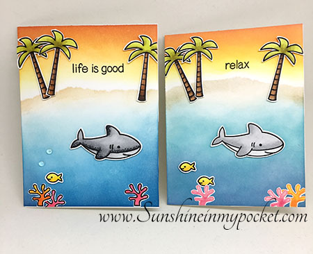
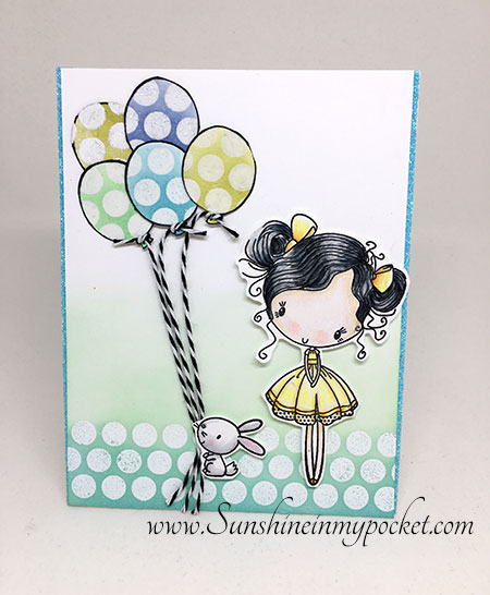
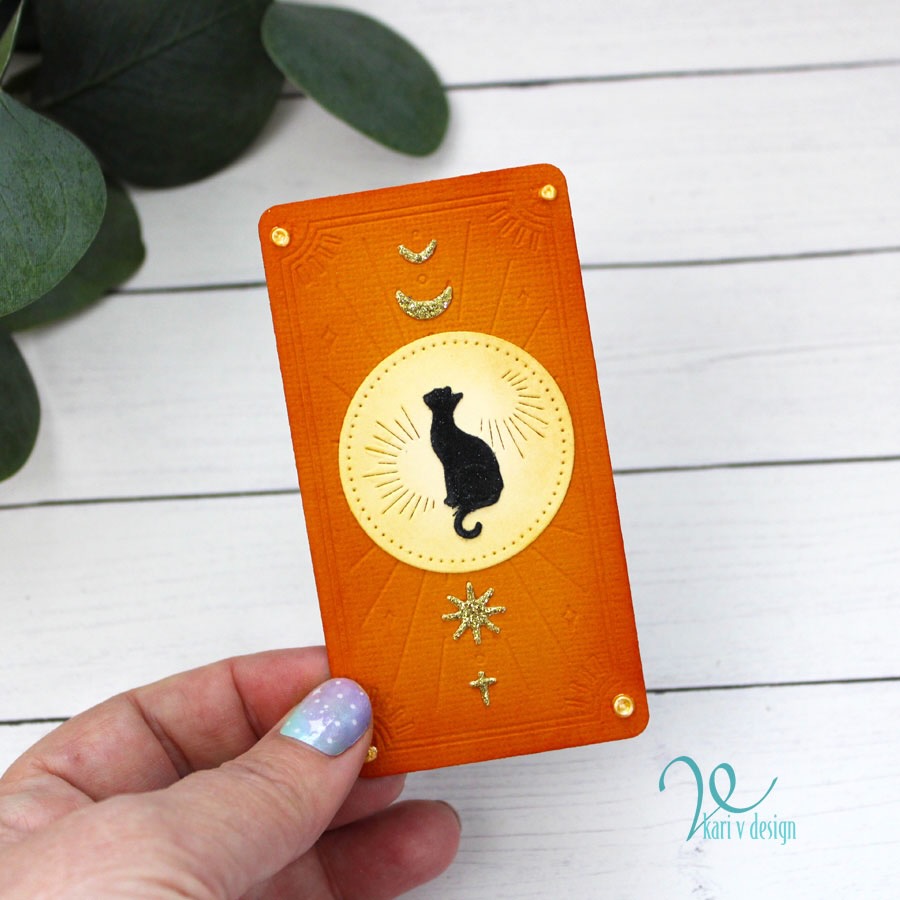
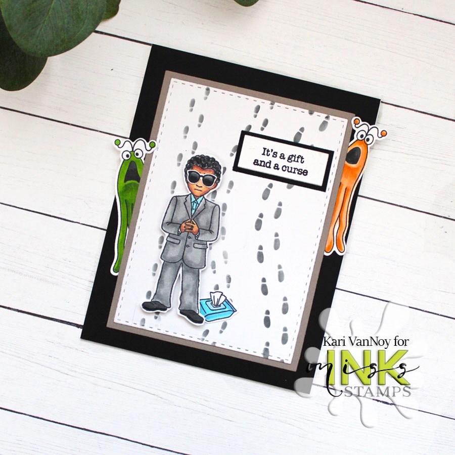
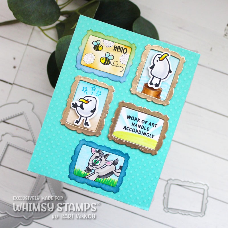
Check out this ink blending! Now, these are not exactly alike (but I had to create some differences so I knew which one was which). The blending LOOKS great on both! I used the same cardstock, the same techniques, the same colors, and the same stamps.
LEFT= Distress Ink (Original)
RIGHT = Distress Oxide
You can see there is a little difference in the Oxides (They are a little less vibrant), but overall they still look GREAT! And, the Distress Oxides are SO EASY TO BLEND!! In fact, they stay on the surface a bit so if you get a harsh line, you can usually blend it out. I was impressed by the ease of blending with them.
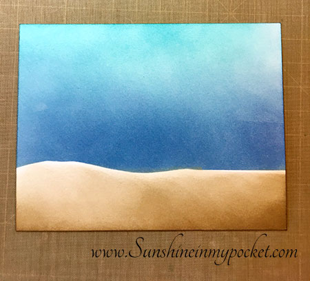
Take a look at the variation in color I was able to get with the Distress Oxides here on Bristol Smooth paper. I really like the way it blends on this paper (it was even easier to blend on the Bristol paper).
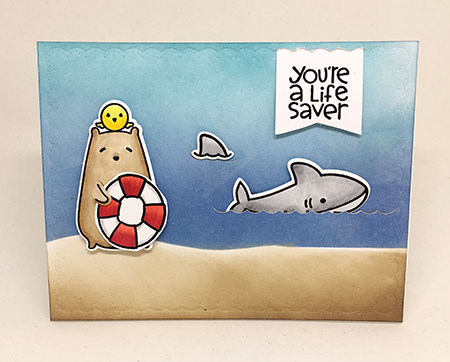
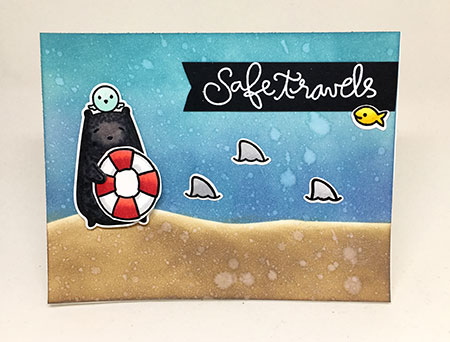
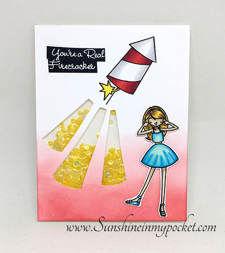
Here I tried the same background with and without water droplets. When using Distress Oxides, the water droplets are definitely more pronounced (than when using original Distress Inks)!
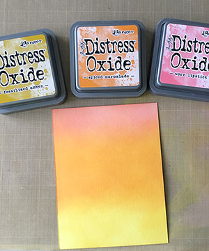
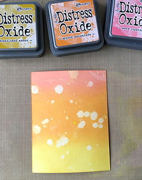
Here I used 3 colors to blend a “sunset.” Then I added drops of water. I did not like how the water droplets were so random at the top on the Worn Lipstick, and some of them were irregular in other spots, too.
So I thought to myself: “Hmmm….I wonder if I can cover those spots up as if they never existed?”
GUESS WHAT?!?!? YOU CAN! (see how the white spot on the very top is no longer there?)
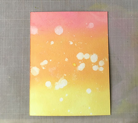
All I did was take more Worn Lipstick Distress Oxide Ink and blend over that droplet. Because it has some pigment properties and sits on top of the paper, it also has the ability to “cover up” some mistakes! So cool.
DISTRESS OXIDES vs. DISTRESS INK (original): STENCILS
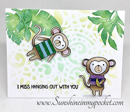
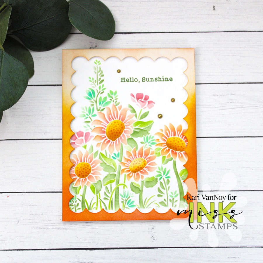
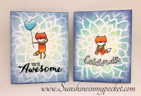
So here’s the next comparison that surprised me. I took the same stencil and applied Distress Inks on one card front, and Distress Oxides on the other. Take a look:
LEFT= Distress Ink (Original)
RIGHT = Distress Oxide
I did not expect this! I was able to get a brighter result with the Distress Oxide Ink because it seemed to blend THICKER. I really liked how bright it was! Wow. Seriously so amazing. I need to try this technique again!
So after these studies, I found that I really enjoyed both. I still tend to reach for my original Distress Inks more (for blending), but it’s because I only have a limited amount of colors in the Distress Oxides. But just before I was nearly done with my comparisons, Ranger released 12 more colors!! Yay!
I hope you enjoyed this comparison. I have more experiments to share throughout the week comparing these two amazing inks. So please do come back!
[Disclosure: Affiliate Links used where possible, at no extra cost to you. Thank you for supporting my blog!]